
Enterprise Design Systems Leadership
Enterprise Design Systems Leadership
Salesforce
Role:
Senior Product Designer
Timeline:
1 year
Team:
PO, Salesforce Architects
The Challenge
After a failed agency implementation, Salesforce’s team needed a design system that could scale rapidly and help unify dozens of disconnected product workflows. Handoffs between architects and developers were causing delays and rework. Business Impact: • Product launches were slowed by fragmented design patterns • Stakeholders lacked visibility into the design system's progress • Manual QA and inconsistent specs led to costly errors
My Approach
1. Rapid Audit & Inspiration • Conducted a full audit of all existing components and user flows • Used the New York Subway Map as a metaphor for scalable, intuitive navigation • Worked closely with architects to align on taxonomy and hierarchy 2. Design System Rollout • Built an adaptable Figma kit and documentation site • Established guidelines for new pattern creation and visual consistency • Facilitated cross-team workshops to champion adoption and evangelism 3. Developer Integration • Implemented a streamlined handoff process with embedded dev tokens • Ran weekly reviews to ensure design intent was preserved through build
Success Goals
Clarify
Visual Standard
Increase
Diagram Adoption
Accelerate
Workflow Speed
Optimize
Data Accuracy
Enhance
CRM Implementation
Improve
User Satisfaction
A System for Systems.
A System for Systems.
A System for Systems.

Approach
Modular Thinking
Designed the diagram kit as a system of components, not static templates, ensuring flexibility while preserving consistency. Created layered logic for environments, data flow, and interaction points.
Evangelism-Driven UX
Collaborated closely with Salesforce evangelists and documentation teams to align the system with actual developer and partner needs, ensuring usability in live technical environments.
Integration-Ready
Optimized the system for seamless export to Lucidchart and dev tools. Focused on clarity, legibility, and hierarchy to support both design and engineering workflows while upholding Salesforce's accessibility promise.
From Chaos to Consistency.
From Chaos to Consistency.

Validation & Iteration Process
Testing methodology:
Piloted the new kit on high-impact features with two scrum teams
Ran usability tests with both designers and engineers to identify sticking points
Collected ongoing feedback via Slack channels and regular team demos
Decision-making framework:
Prioritized fixes based on real user feedback and developer adoption rates
Maintained living documentation that evolved with each sprint
Results & Business Impact
Quantified Outcomes:
Cut onboarding time for new devs by 50%
Reduced design-developer misalignment tickets by 40%
Accelerated feature delivery: Deployed 3 major product updates in 2 months (previously took 6 months)
Improved design consistency and stakeholder satisfaction
Qualitative Impact:
Developers and designers reported greater clarity and fewer handoff issues
The design system became the new standard for future Salesforce projects
Agency partners recognized improved efficiency and collaboration
Strategic Learning & Reflection
Biggest insight:
Clear, visual documentation—like the subway map metaphor—drives alignment across disciplines, not just within design.
Process innovation:
Built a scalable, living design system that remains flexible as Salesforce product needs evolve.
Leadership growth:
Learned to bridge business, design, and engineering—building trust through transparency and shared goals.
Why This Project Demonstrates Senior-Level Design Thinking
Strategic Impact: Directly addressed delivery bottlenecks and enabled rapid product scaling
Cross-Functional Leadership: Facilitated deep alignment between architects, engineers, and business
Process & Systems Thinking: Created modular, maintainable resources that raised the bar for future projects
Data-Driven Outcomes: Results show real impact on both efficiency and product quality
Collaborative Mindset: Fostered a culture of continuous improvement and shared ownership
“Our work on the architecture diagram design system directly contributed to the launch of Salesforce’s Well-Architected visual standards—now a company-wide reference for technical clarity.”
Featured in: Salesforce Well-Architected / Diagrams overview.
Learn more: Well-Architected Overview, What’s New with Salesforce Diagrams

Redesigned complex architecture diagrams to be more modular, scannable, and consistent for technical teams.
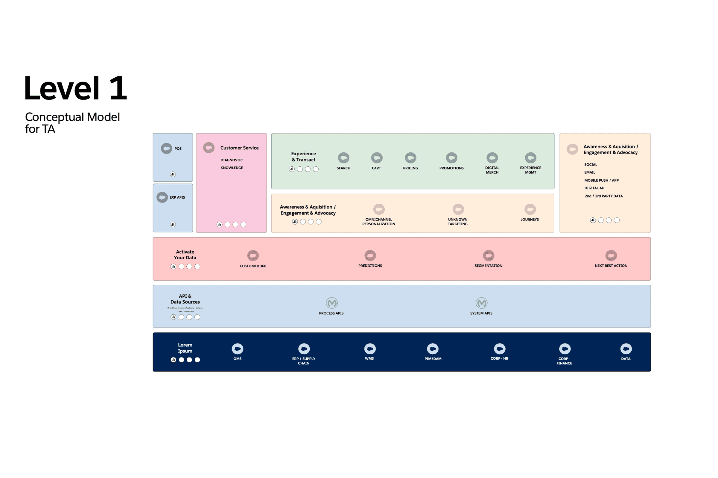
Level 1: Mapped out the top-level conceptual model to provide clarity on the system’s structure, priorities, and user journeys.

Level 1: Broke down platform architecture into visual layers, showing relationships and integration points between major system modules.

Level 2: Sales Provisioning - Visualized service provisioning flows to simplify onboarding, streamline configuration, and clarify dependencies for stakeholders.
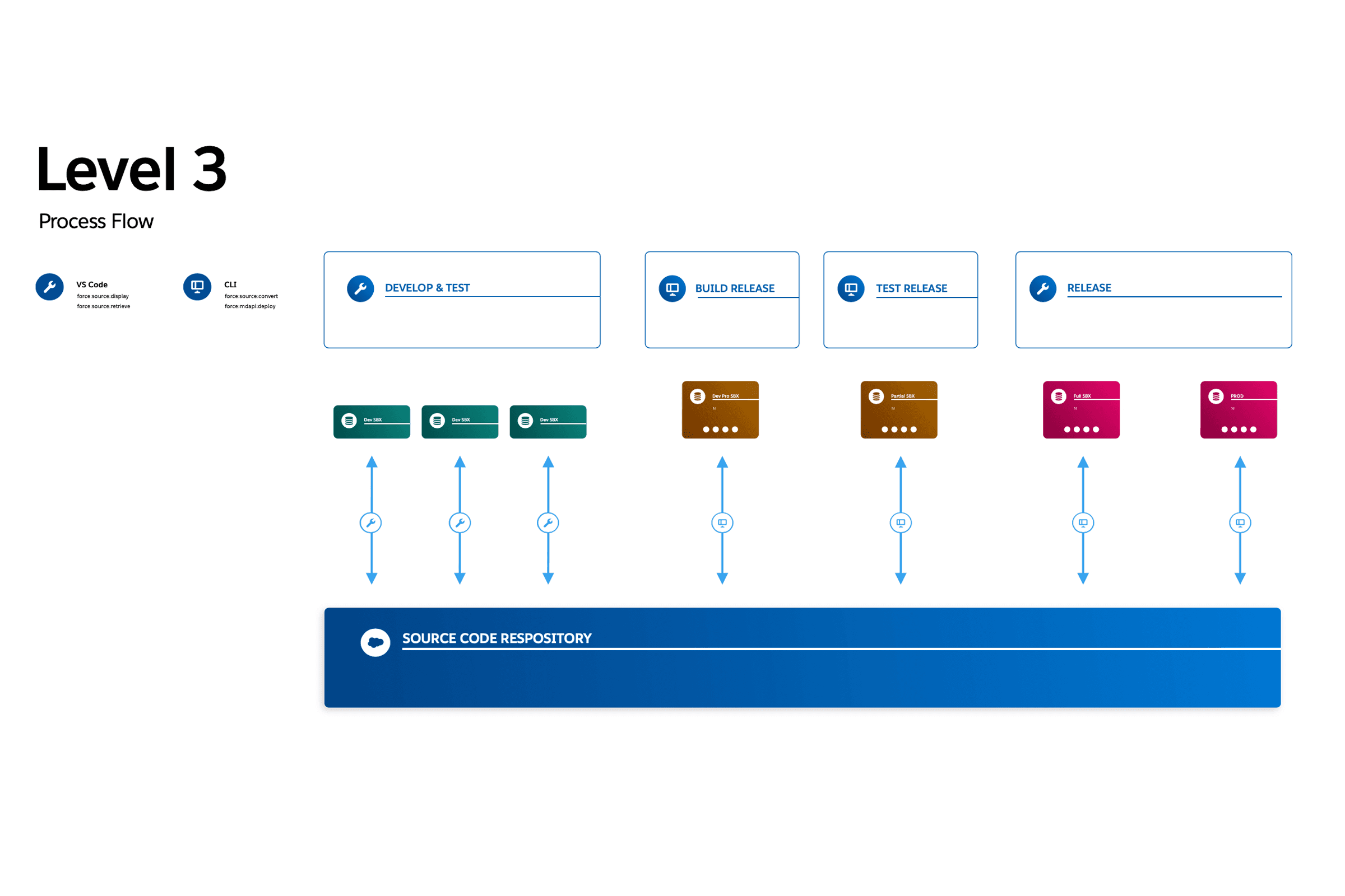
Level 3: Process Flow - Documented core process flows for delivery, release, and testing, making it easier for teams to align and follow best practices.
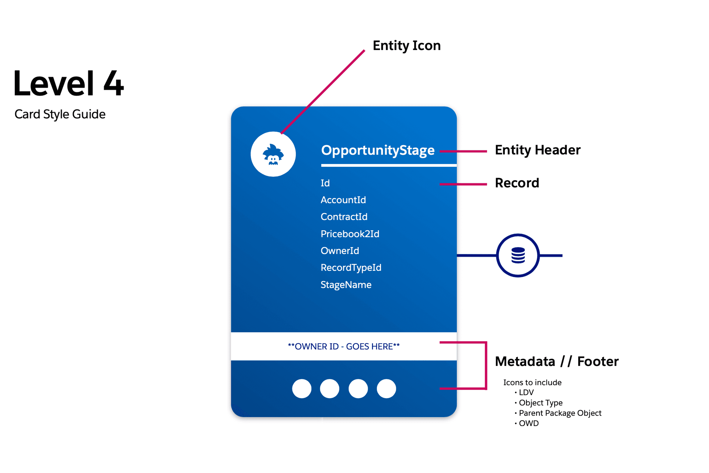
Level 4: Card Style Detail - Established reusable diagram components and a visual style guide to drive system-wide consistency and accelerate adoption.
Next case
Dive into the product design for Levr’s next-gen betting app.