
Savings Dashboard & BI UX
Savings Dashboard & BI UX
Elevate by Principal
Role:
Senior Product Designer
Timeline:
3 months
Team:
PM, Data Analyst, Engineering, Customer Success
The Challenge
Users of Elevate’s dashboard weren’t seeing or understanding their potential savings, leading to lower contract activation and missed upsell opportunities. Data visualization and insights were buried, and feedback from customer success pointed to frequent confusion. Business Impact: • Low engagement with dashboard features • Missed revenue from under-leveraged savings insights • Support team overburdened by repeated “how do I?” questions
My Approach
1. Data Visualization Audit • Mapped current dashboard flows and user interactions • Partnered with data analysts to surface actionable insights • Conducted user interviews to clarify what “savings” meant to different personas 2. Insight-Driven Redesign • Introduced a new visual language for clear, immediate savings recognition • Created scenario-based recommendations tied to business goals • Embedded contextual help and tooltips for self-serve guidance 3. Engagement-First Approach • Developed a “revise data” workflow for users to update inputs and see instant results • Ran usability tests to validate changes and fine-tune information hierarchy
Success Goals
Clarify
Potential Savings
Increase
Engagement
Accelerate
Contract ACT
Optimize
Data Accuracy
Enhance
CRM Implementation
Improve
User Satisfaction
Power to the Owner.
Power to the Owner.
Power to the Owner.

Approach
Visual Storytelling
Used simple charts and segmentation to show users how much they could save based on their actual spend—and how to take action.
Modular Design
Built reusable card components to allow the dashboard to scale with new categories, supplier programs, and personalized insights.
Re-Engagement Built In
Integrated prompts and dynamic alerts tied to new data, giving users a reason to return, recheck, and act every quarter.
Turning Spend into Strategy.
Turning Spend into Strategy.

Validation & Iteration Process
Testing methodology:
Tested dashboard prototypes with real users and customer success reps
Used A/B tests to optimize CTA placements and graph interactivity
Iterated on content clarity and visual hierarchy based on feedback
Decision-making framework:
Prioritized changes that improved clarity, engagement, and conversion to contract activation
Regularly synced with PM and analytics to measure user actions and business impact
Results & Business Impact
Quantified Outcomes:
60% increase in dashboard engagement within two months of launch
30% boost in contract activation from dashboard touchpoints
Significant reduction in support tickets related to “how does this save me money?”
Clearer path to revenue expansion through targeted upsell features
Qualitative Impact:
Users reported the new dashboard “made it real” and felt more confident in the platform
Customer success cited faster onboarding and fewer “what does this mean?” calls
Dashboard became a key differentiator in sales conversations
Strategic Learning & Reflection
Biggest insight:
Making savings feel personal and transparent built user trust and accelerated adoption.
Process innovation:
Integrated real-time data, user feedback, and design system components for rapid iteration.
Leadership growth:
Learned to translate business objectives and technical requirements into clear, user-centered solutions—aligning product, engineering, and customer-facing teams along the way.
Why This Project Demonstrates Senior-Level Design Thinking
Business Alignment: Tied design to revenue, adoption, and customer satisfaction
User Advocacy: Drove meaningful, measurable improvements in the experience
Systemic Solutions: Created scalable, modular dashboards for future features
Team Collaboration: Brought cross-functional teams together for faster, better outcomes
Rapid Impact: Launched, validated, and refined a mission-critical feature in record time
Process & Validation
Audited user analytics to spot where users dropped off.
Designed rapid prototypes showing prioritized savings and user-specific insights.
Partnered with marketing/CX for in-app nudges and lifecycle messaging.
Validated with A/B tests and user feedback.
“It was the first time a business owner said, ‘I didn’t know I could save this much—where do I sign?’”
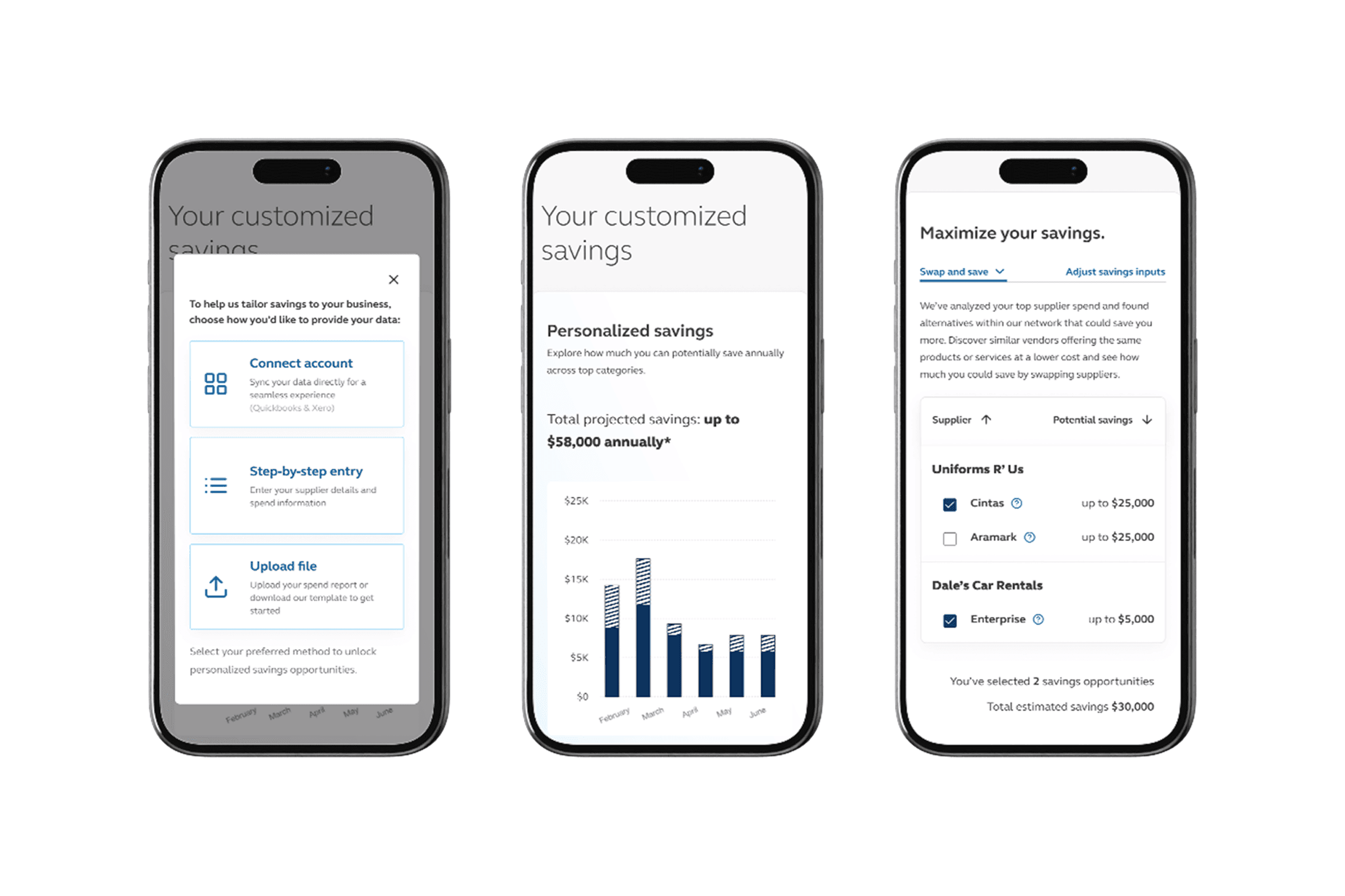
New users are guided from onboarding to entering spend data and instantly see their personalized savings and actionable recommendations.
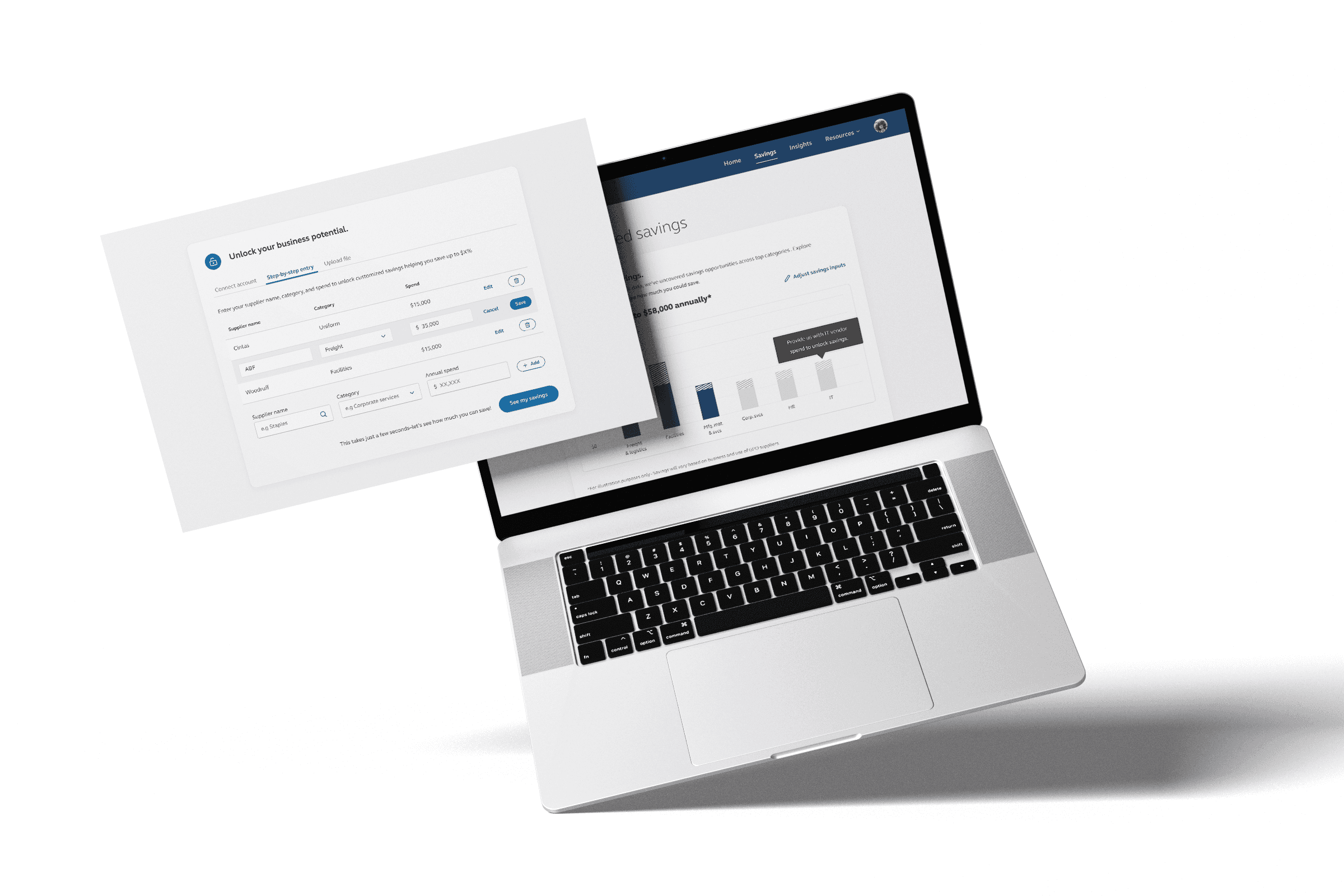
Business owners can easily edit vendor and savings information on the fly, making it simple to update data and keep projections accurate.

A series of savings page screens illustrates the iterative process of refining each detail for clarity, accuracy, and ease of use.

Mapping every touchpoint and stakeholder from registration to new user onboarding, ensuring seamless collaboration between business owners, customer managers, and marketing

Next case
See how I streamlined onboarding for Elevate by Principal.